Since British television first
produced
Pride and Prejudice
in 1938, Jane Austen’s best-loved work has regularly served as the raw
material for lavish heritage costume dramas and recontextualised
contemporary comedies such as
Bridget
Jones’s Diary (2001). But whether adaptations of Jane
Austen’s novel are slavishly faithful or liberally intertextual,
Pride and Prejudice is a culturally
and emotionally loaded text, so adapting it is always a significant
gesture. As Deborah Moggach, screen-writer for the 2005 Focus
Features production of
Pride and
Prejudice has explained, adapting Austen’s story means
“mess[ing]” with “the nation’s favorite” novel, “as familiar to many
people as their own heartbeat” (Moggach 19). Therefore, what
makes that heart beat—love, money or nationalism—is always at stake in
bringing the nation’s most popular romance to the screen, making
adaptations of
Pride and Prejudice
excellent indicators of the ideology and
Zeitgeist that informed them.
1
In “Filming Tourism, Portraying
Pemberley,” Linda V.
Troost has proposed readings of adaptations of Austen’s novel produced
in 1979, 1995, and 2005, precisely as a means of getting at the
ideological and aesthetic agendas—the heartbeat—that shaped them.
She argues, for example, that the 1979 BBC production reflects the
strong Labor government in power when it was made and is, therefore,
openly critical of the upper classes. Hence, because screenwriter
“Fay Weldon and director Cyril Coke were not interested in
romanticizing the British upper class,” viewers are never allowed to
“forget that [the class] system requires many menials” (486,
487). In contrast, the 1995
Pride
and Prejudice mini-series produced by the American A&E
network and a “post-Thatcher BBC,” opts for high production values
rather than political critique (488). The series was also part of
a bid to promote the British tourist industry, which the producers did
by romanticizing Darcy and aligning him with Pemberley’s exquisite
“natural” grounds, thereby softening the edges around class
snobbism. This strategy was highly effective in marketing England
as a tourist destination with much culture, history and parkland to
offer. Lyme Park, which served as the Pemberley location in the
mini-series, promptly began advertising itself as “featured in the BBC
production of Jane Austen’s novel
Pride
and Prejudice” when the mini-series was released.
2
By the time Joe Wright was
directing his 2005 adaptation, locations
related to
Pride and Prejudice
were already a significant feature of British tourism, Tony Blair had
been Prime Minister for eight years, and the culture of New Labor no
longer saw “power, class, and the past” as “major threats to modern
politics” (498). This new attitude enabled the National Trust and
heritage properties to profitably “populariz[e] aristocratic culture,”
so that “high culture [was] no longer the romantic Other” and under
attack as it had been throughout the 1980s and well into the 1990s
(Quest-Ritson, qtd in Troost 498). One might object, however,
that although this most recent version of
Pride and Prejudice may indulge the
aristocracy, it also features rural squalor, muddied hems, and plenty
free-range chickens and pigs. If one agrees with Troost, the
earthiness of this film is also of a piece with the implicit promotion
of British heritage that informs it, equally supported by heritage
property owners and the National Trust to make life in aristocratic
Britain seem sublime and familiar at the same time. And
certainly, with its lavish use of impeccable historic locations and its
eye for detail, the film performs all of the functions of the classic
heritage film in spite of its grittiness, affording viewers reassuring
glimpses into “downstairs” culture viewed through upper-class splendor,
so that it ends up celebrating rather than critiquing the past.
In Wright’s adaptation, the New
Labor stance on the issue of class
privilege is perhaps most evident in the scene directly preceding the
Pemberley segment, where Lizzy attempts to argue her way out of a visit
to Darcy’s estate. Whereas in the novel we are told that she is
“applied to for her approbation” but remains silent, in the film Keira
Knightley, who plays Elizabeth, counters with, “But he’s so . . . so .
. .
rich.” To this, the
cinematic Mr. Gardiner replies, “My heavens, Lizzy what a snob you
are. Objecting to
poor
Mr. Darcy because of his wealth. The
poor man can’t help it” (my
italics). In essence, Mr. Gardiner defends Darcy’s wealth and
power as something that, like a physical defect, the “poor” man cannot
help. The New-Labor message here is clearly that the aristocracy
and high culture should no longer be “othered” but instead pitied as
having been handicapped by history and misunderstood, so that both the
class and its culture can now be properly appreciated and enjoyed.
As if to
reinforce Mr. Gardiner’s defense of Darcy’s wealth, this
moment is followed directly by a wide-angle long shot down the road to
Pemberley, giving us the full benefit of the estate’s splendor and
magnitude. The segment ends in a perfectly framed establishing
shot of majestic Pemberley and its sumptuous grounds, “where natural
beauty had been so little counteracted by an awkward taste,” providing
us with visual support of the aristocracy’s impeccable taste and
appreciation of nature (245). The reverse shot of Elizabeth’s
reaction to the vista reveals a gaze that is incredulous and desiring
at once, accompanied, seconds later, by a burst of laughter, signifying
something like, “I can’t believe my (potential) luck!” In other
words, by 2003, wealth and class are no longer necessarily bad things
and need not be criticized to insure a film’s popularity.
Three Gallery Scenes
As I have shown, analyzing how
Pride
and Prejudice was imagined at specific junctures in the history
of its adaptation permits us to pinpoint agendas that are political,
economic, cultural, or any combination thereof, reflected in details of
costuming, architecture, landscape and the representation of national
identity. Following this same strategy, I now want to narrow the
focus of my argument to the portrait scene in the 1940 and 1995
adaptations, which will provide a background against which to present
my analysis of the 2005 Focus Features film in some detail.
I have chosen
to concentrate on this multilayered scene in the text, as
well as in the three adaptations to which I refer, because it draws
many of the threads of the narrative together. It is also here
that Elizabeth and the viewer/reader are given a moment to contemplate
Darcy’s country seat which, when Austen was writing, “was not simply a
home: it was [the proprietor’s] principal source of income and
the economy of his part of the world” (Troost 479). For
Elizabeth, the estate visit is of utmost importance because she knows
that playing her cards in such a way as to permit salvaging some of her
(reverse) class prejudice could make her the proprietress of the
estate. The economic balance of the text, therefore, begins to
shift as Elizabeth realizes “that to be mistress of Pemberley might be
something!”—a shift that gets underway on the grounds and is made
complete in the portrait gallery (250-51). It is, of course, no
coincidence that this change of heart takes place in a room that serves
as a showcase for portraits certifying Darcy’s aristocratic lineage and
for collected art treasures that communicate taste, power and wealth.
This pivotal
episode is also carefully constructed to create suspense
as our focus (through Elizabeth) is narrowed from the grounds, to the
mansion exterior, to the interior, as we are drawn ever closer to the
gallery. Hence, the instant in which Elizabeth’s eye finally
alights on the much-anticipated portrait is emotionally charged,
befitting both the reversal it sets up and the temporary intimacy in
which she is finally at liberty to take the measure of the inner
man. More important, because the portrait scene thematizes the
act of looking (the reader/viewer looking at Elizabeth, who herself is
looking at a portrait), it functions as an allegory of the power and
politics of looking. In the gallery scene, the intimidating
figure of Darcy is reduced to a still and anodyne, two-dimensional
likeness so that the hierarchy of who is free to gaze at whom is
interrupted, providing Elizabeth with the leisure to contemplate a man,
who has it “in his power to bestow” so “much of pleasure or pain”
(250-51). The significance of her look can be read in how quickly
Austen returns the gaze to Darcy, by situating Elizabeth in front of
“the canvas, on which he was represented, and fix[ing] his eyes upon
herself” (251). This rapid shifting of the privilege of unabashed
gazing implies that its attribution to Elizabeth is inappropriate, and
it has the advantage of softening the unpleasant “impropriety” of a
gaze that she is habitually obliged to suffer.
This loaded and decisive episode
in the text constitutes a serious
challenge for filmmakers since there are few effective methods for
transferring thought rendered novelistically in free indirect discourse
to film, outside of the now hackneyed voice-over. In adapting
Pride and Prejudice, therefore,
directors have had to find ways to signal the shift of the gaze from
Elizabeth to Darcy while communicating the power balance that it
signifies. As I hope to show, the visual aesthetics of
how this content is communicated in
the 1940, 1995, and 2005 adaptations have a great deal to tell us about
whom these films are addressing. With this in mind then, I would
like briefly to discuss how the 1940 Hollywood and the 1995 BBC/A&E
productions have dealt with the gallery scene before analyzing how this
same scene in the 2005 Focus Features adaptation articulates certain
aspects of the contemporary cultural agenda.
1940
In the 1940
MGM adaptation, the gallery scene is paradoxically and
glaringly present in its absence. The entirely Pemberley scene,
including the gallery, has been cut, and this omission effectively
leaves Elizabeth’s reasons for changing her opinion of Darcy rather
vague, since the obvious financial incentive of Pemberley and the
opportunity to contemplate the portrait are dropped. As a means
of compensating for the lack of motivation behind Elizabeth’s dramatic
change of heart, Laurence Olivier’s Darcy is consistently chivalrous
and complimentary throughout the film, and the lovers’ relationship is
rather ambivalent and flirtatious from the outset. As a result,
Elizabeth’s hostility seems more coquettish than rational, as though it
were a sort of affectation rather than real, if misguided, anger.
But while the scene leaves a gap at the level of character motivation,
its omission is all the more striking as a missed occasion to treat
viewers, just recovering from a major economic depression, to a lavish
scene of old-world opulence. Indeed, even if moving the production to a
heritage location was not an option, studios typically built sets to
represent European settings such as the gallery at Pemberley, with the
added benefit of flatteringly and pleasurably aligning the viewer with
historical connoisseurs of high-culture tastes in fine art.
3
Cutting this scene
might seem an odd choice, given the opportunity it
affords for visual opulence and the emotional grounding for characters’
actions. As I suggested previously, however, this node in the
text also constitutes a disruption of the politics of looking. By
treating looking as a politicized action I am, of course referring to
Laura Mulvey’s watershed essay “Visual Pleasure and Narrative Cinema”
(1975), in which she forwarded the concept of the cinematic male gaze,
that is, the gaze of patriarchal privilege that is free to observe
pleasurably and at will. In this essay, Mulvey is specifically
discussing classical Hollywood cinema of the 1930s, 1940s and 1950s,
which presented a visual world structured and controlled by the male
gaze, and provided viewers with a “satisfying manipulation of visual
pleasure” (10). As she further explains, the object of, or the
complement to, the male gaze is the female, who is painstakingly
constructed to be looked at:
In a world ordered by sexual imbalance, pleasure in
looking has been
split between active/male and passive/female. The determining
male gaze projects its fantasy on to the female form which is styled
accordingly. In their traditional exhibitionist role women are
simultaneously looked at and displayed, with their appearance coded for
strong visual and erotic impact so that they can be said to connote
to-be-looked-at-ness. (10)
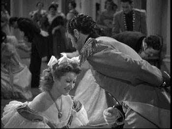
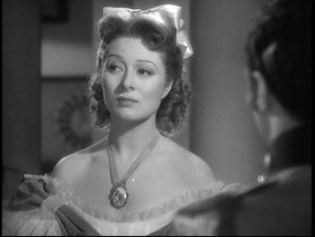
Quite obviously, Greer Garson’s Elizabeth was lighting up the screen
when “the magic of the [classical] Hollywood style [was] at its best”
(8) and was styled to modestly invite close scrutiny, rather than to
aggressively return the gaze.
Mulvey’s theory, moreover, is
eminently applicable to the western
cultural tradition at large as it expresses itself in representational
modes of art like painting, sculpture and novelistic discourse, wherein
the female form is arranged so as to enhance visibility, while
projecting reassuring and validating availability.
4
In
patriarchal culture, as in
Pride and
Prejudice, the power to enjoy sources of visual pleasure such as
the female body with impunity and without restriction, is the exclusive
domain of the empowered male subject of means, and not the prerogative
of a female subject. Hence, directing her protagonist’s gaze at
Darcy’s portrait without inhibition or restriction was a significant
gesture when Austen was writing, a fact which explains her quick move
to normalize this moment’s strangeness by relocating the gaze, rather
awkwardly and uncannily, in Darcy’s portrait.
5
From this perspective, Robert Z.
Leonard’s decision to cut the scene
was an oddly appropriate way to faithfully reproduce Austen’s treatment
of the politics of looking given that, without a voice-over, it would
have been impossible to communicate Elizabeth’s impression that the
portrait is actually staring at her. In keeping with the politics
of looking then, scenes in which women returned the gaze were rare in
1940, and accordingly Garson has been directed to address her
interlocutors from an oblique and coquettish angle or to cast her eyes
modestly downwards.

|

|
In other words, within the
historic context of both novel and film, a
scene in which a female subject directs her gaze at the figure of man
constituted as an object of desire would have clearly violated the
dominant aesthetic and might well have presented itself to a Hollywood
filmmaker as convenient scene to cut. Hence, where the novel was
able discursively to diffuse Elizabeth’s rather forward act of looking,
the film simply drops the scene, avoiding any abrupt reversal or
interruption of the pleasurable alignment of spectators with the male
gaze that the film had established to that point.
6
1995
By 1995, however, things had
changed—at least some things.
Mulvey’s article had spawned a whole school of feminist film criticism,
and students throughout the humanities had read about visual pleasure
and the gaze in one context or another. The 1990s also saw a new
kind of heritage cinema that obsessed over getting historical details
correct in a bid to claim authenticity, while freely giving the
ideology of the textual antecedent a facelift where needed to appeal to
contemporary audiences. Typical of this era in heritage film was
Sense and Sensibility (1995), for
which Emma Thompson wrote a screenplay that has come to be synonymous
with the concept of “feminist revisionism.” What such feminist
revisionist heritage films seek to do, at least in my opinion, is to
have it both ways. By stressing features of adapted texts that
might be construed as portraying emancipated female behavior, while
playing down other historical aspects of the text which contemporary
filmgoers might find distastefully sexist, these films somehow convince
us that women were already feminists in Jane Austen’s day, in spite of
constricting corsets and the economic imperative to advertise oneself
on the marriage market.
The 1995
Pride and Prejudice
mini-series has it both ways by sporadically transgressing the order of
the gaze in order to hold out visual pleasure to (feminist) female
spectators. This viewer-pleasing strategy is perhaps most
dramatically, and certainly most memorably, demonstrated in the scene
where Colin Firth, as Darcy, gallops to a pond on the Pemberley
grounds, strips to his shirt, and plunges in. While this gesture
minimizes the harshness of the class system by aligning Colin Firth
with nature rather than with stuffy aristocratic sensibilities, he is
also given a revisionist reading which renders him both sensitive and
emotionally vulnerable. However, given that this scene prompted
fans to refer to the actor as Colin “Wet-Shirt” Firth, I think it is
also safe to say that the film gives female viewers the power to turn a
male subject into an eroticized object, thereby reversing the hierarchy
of the gaze, however fleetingly. Seen in this light, the
Pemberley gallery scene, which features a three-quarter-length portrait
of a smiling Darcy in a Gainsborough-like landscape, as well as a
miniature of his face placed in a glass case so that Elizabeth has to
look down at it, doubles her viewing pleasure (and the spectator’s)
while positioning her, at least metaphorically, on top.
2005
In the Focus Features adaptation,
the Pemberley gallery scene is given
a good deal of attention and screen time, and it boasts
production-values that set it apart from the aesthetic tone of the rest
of the film in terms of pace, shot frequency and duration, and
lighting. Moreover, Wright’s decision to shoot the scene in a
sculpture gallery at the Chatsworth estate and to have Matthew
Macfadyen rendered as a three-dimensional bust rather than on a flat
canvas also gives this scene a heightened and memorable visual
intensity. According to Moggach, the makers “just saw the
sculptures and realized [they were] much better than pictures. . . .
[T]hey’re also so erotic, all those breasts and buttocks that she
trails her finger along.”
7 Likewise,
Troost concludes that “the
2005 film uses the visit to Pemberley to make Elizabeth confront her
own sexuality” (493), and Wright claims in the DVD commentary that this
scene “is about sex. This place is about bodies.” I would add,
however, that the change in medium from portrait to bust is closely
related to an aesthetic trend that is currently very prevalent in film,
namely the sporadic incorporation of the look and feel of interactive
media into otherwise cinematic productions.
Although many would automatically
identify interactive media with
futuristic adventure films as opposed to historical costume drama, the
impact of interactive narrative in the form of video games is
remarkably pervasive in mainstream contemporary film across
genres. The simple fact that computer games have begun to gross
significantly more than the film industry has lead studios to respond
by releasing video games that promote almost all major films, either
before, after or upon a film’s release. Arguably, heritage film
is one of the few movie genres that rarely lends itself to being
released in video game form; however, my argument in this regard is,
somewhat broader, modeled on what Thomas Elsaesser and Warren Buckland
have referred to as “video game logic” (162-63). According to
Elsaesser and Buckland, the logic of video games expresses itself in
dramatic structures that involve discernable rules and challenges that
must be systematically overcome before the protagonist can advance to
another level. While obvious examples include crime and adventure
films and films adapted directly from video games, movies from a
rapidly expanding variety of genres, including romance, “at certain
moments switch to [the logic] of ‘digital narrative,’ as found in video
games” (Elsaesser and Buckland 147). The influence of this logic
may in part account for Wright’s statement in the DVD commentary that
the
mise en scène at
one point in
Pride & Prejudice
looks like
“something out of an adventure film, which this is in a way.”
Just as films of many genres now
borrow, at least occasionally, the
structural logic of video games, there is a broader tendency in
contemporary mainstream film to borrow the look and “feel” of
interactive media for segments of varying duration. Such moments
are indicative of what I would call the video game aesthetic,
frequently mobilized to communicate an intensified state of mind or
sensory perception and to invite viewer involvement, or what Wright has
called “immediacy” (DVD commentary). The concept of immediacy is
borrowed from the jargon of game designers, whose goal is to provide
players with a sense of fully fleshed-out presence in the game
world. Since, however, interaction is not an option for film
viewers, filmmakers attempt to reproduce visual aspects of the
experience of digital worlds, thereby hoping to trigger a sensation of
heightened involvement in the viewer. And since video game design
has left Pac Man far behind and is now capable of producing rich, lush
detail, the look and feel of interactive games are readily adaptable to
any historical period and can produce tremendous visual and kinesthetic
effects.
8 In other words, video game
aesthetics have greatly
extended directors’ range and palette at a time when cinema has to work
hard to keep up in a highly competitive market replete with enthralling
interactive entertainment.
The appearance of the aesthetic
code of video games in contemporary
cinema, and the heightened involvement it induces in some spectators,
may be likened to the intercalation of extended epistolary exchanges in
texts otherwise composed of prose. However subtle and fleeting
the appearance of this code may be in films, it has the advantage of
being instinctively legible to a large segment of relatively young
viewers, signaling immediacy while reinforcing identification with a
particular screen persona. This code makes at least two brief
appearances in Joe Wright’s adaptation of
Pride and Prejudice and
specifically addresses relatively young female viewers. Indeed
Wright, who was thirty-one when he directed the adaptation and was
worried about being too “cool,” “street” and “edgy” for the project,
referred to the finished product as “a teen movie” in the tradition of “
Grease and
The Breakfast Club,” repeatedly
mentioning that Keira Knightley was just nineteen when she played
Elizabeth Bennet and that the film is “about very young people falling
in love.”
9 Throughout the following
section, I will also be
concerned with the status of the gaze in contemporary cinema and how,
in the two scenes I will discuss in greater detail, the gaze is
directly and powerfully connected with the aesthetics of interactive
media that makes brief but significant appearances.
Looking
and Touching
One of the hallmarks of this film
is Wright’s insistent use of
close-ups, a technique which the director claims he chose to mimic “the
narrative beats of the story, . . . the atmosphere and tone of the
book” (Abeel). A large number of these close-ups focus intensely
on Keira Knightley’s large, luminous eyes, which she directs
uninhibitedly and unswervingly at anyone in her path. As I have
just explained, Wright knowingly addressed a young female audience in
making this film, and I would argue therefore that it is significant
that Knightley is frequently presented in the act of gazing. The
constant presence of these shots reflects the twenty-first-century
target group’s at least partial awareness of the power of the gaze, as
well as the current highly sexual and aggressive version of feminism
emblemized by girl groups like the Pussycat Dolls. Unlike
revisionist films of the 1990s that gave women the privilege of knowing
what it might be like to stare at attractive objects with impunity for
a brief moment, this Elizabeth’s gaze is constant and frankly
intrusive, signifying that she is free to penetrate and observe any
space presented in the film.
In order to explain how
Wright has updated Elizabeth Bennet
better to represent contemporary culture, I would like to turn to the
scene in which Elizabeth reads Darcy’s letter revealing Wickham’s true
nature and giving his assurance that no more proposals are
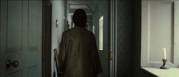
forthcoming. Here, by means of a continuous, over-the-shoulder
tracking shot, we view a restless Lizzy in her nightdress as she
meanders down a long corridor. In his recent book on the
influence of video games on all kinds of contemporary artistic
production, Alexander Galloway argues that the framing and filming of
scenes like this one exemplifies “the preponderance of continuous-shot
film-making,” which all genres of recent film have borrowed from
interactive media (65). Continuous shots that remain stationary
or maintain a single point of view from one point to the next
technically and aesthetically mimic the avatar point of view.
This technique is a visual code familiar to gamers as well as a growing
group of people who use other kinds interactive media such as virtual
tours, not to mention those who watch TV and film, both of which
increasingly incorporate this code. According to Galloway,
continuous shots are “essentially a sublimation of the absence of
montage in digital poetics” and now appear in movies where montage
editing, such as shot-reverse-shots and cross-cuts, would have been
used in the past as a means of conveying emotion. In other words,
new directors like Wright are currently shooting films that incorporate
the point of view common to video games known as third and first person
shooters—a tactic that serves as a means of intensifying
identification. This is, of course, not to suggest that viewers can
somehow interact and move Keira Knightley around like they would a game
avatar, nor that the scene’s aesthetic framing necessarily signifies
violence, but rather that the point of view created by a continuous
tracking shot is borrowed from interactive media.
10
Avatars in video games have the
added advantage of appealing to the
spectator as “an extension” of their own bodies, stimulating
“continuous identification” (Rehak 103). Interestingly enough,
Wright wants the viewer to enter into just such a relationship with his
protagonist and has explained that “the whole idea of the film is to
make it as subjective as possible so you are constantly seeing the
world through [Elizabeth’s] eyes.” In other words, it is no
coincidence that at this highly charged emotional moment, in a film
that Wright hopes to make us see though Knightley’s eyes, he switches
to the over-the-shoulder tracking shot, triggering just that kind of
personal involvement on the part of the spectator.
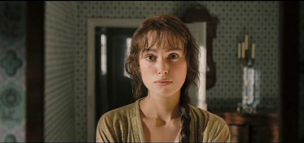
Following this shot, Elizabeth
enters her bedroom and gazes at her own
image in the “mirror” for what seems an interminable duration.
Since Knightley is actually staring directly into the camera lens
rather than a mirror, the visual code asks us to see through her as she
makes her way down the hall and then to view her through an implied
mirror, an effect suggesting that the viewer and Knightley are one, or
at least asking the viewer to narcissistically identify with
Knightley.
This sequence is one of the first nods in the film to the aesthetics of
contemporary interactive media that the filmmaker, entirely consciously
or not, has incorporated into the film. What it effectively
accomplishes is the alignment of the spectator with what is now the
female gaze as a form of directed, empowered eroticism.
The second instance of this aesthetic
begins as the
camera locates the Gardiners’ carriage through an aerial shot as they
drive up to Pemberley and slowly shifts to a wide-angle long
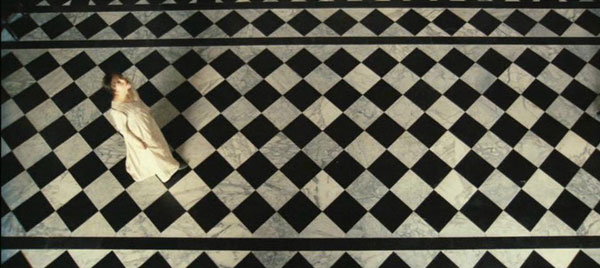
shot. This move is repeated as we find Elizabeth in the hall of
the estate, though an interior aerial shot that directly parallels the
shot just taken outside. These two shots create an illusion of
freedom of movement as well as a brief sensation of vertigo, both of
which are essential to the kinesthetic computer game experience to
which I think this film refers, albeit subtly and intermittently.
11 More important, Elizabeth is filmed
looking up,
thereby enhancing our sense of vertiginous depth, while the flooring
beneath her creates an even more intense illusion of receding
depth. As Norman Bryson pointed out in
Looking at the Overlooked,
this kind of flooring originated in ancient Rome, and its goal was to
produce “perceptual uncertainty concerning the depth of field, . . .
creat[ing] a dynamic field that expands and scintillates with energy”
(33). Although it is surely a happy coincidence that the entry
hall in Chatsworth is tiled in such a way, the director took full
advantage of it, in order to create the illusion of deep, projected
space—an illusion that is absolutely essential and fundamental to the
computer game experience.

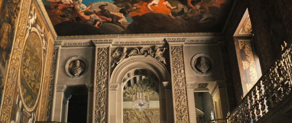
The next shot, with equal fortuitousness, seems to capture the spatial
aesthetics of the Renaissance, so distant from and yet so vital to new
media. In other words, a point-of-view shot shows us what
Elizabeth is looking at, namely the frescos on the ceiling, which rely
for their illusion of depth on the fifteenth-century innovation of the
vanishing point. The depth of this shot is further enhanced by
the archway framing the gallery into which Elizabeth is about to enter,
reminding us of the Renaissance notion that representation was meant to
provide a window to the world that would seduce the viewer into
believing the illusion of depth (see Bolter and Grusin 21-31).

Interactive media such as video
games quite literally provide viewers
with the kinesthetic illusion that they have entered a projected space
and may explore and participate in this technologically mediated
space. Hence, whereas the visual illusion that film affords
viewers relies on the 180-degree rule, video games hold out the
illusion of having the freedom to move one’s avatar a full 360 degrees
at any given time. This illusion allows gamers to act as
directors and cameramen of their own films, circling three-dimensional
objects, opening doors, and looking into cupboards and closets.
In other words, although this perception is of course an illusion,
computer games give the player the feeling that they are at liberty to
penetrate any corner of the gamescape, and this illusion is precisely
the feeling that Wright claims to have wanted to give the spectator in
this scene. As he explains, “I wanted the audience to feel like
they were living at this time, and involved deeply. I wanted a
360-degree world, where you could look around any corner. . . . You’re
then able to go in and out of doors and in and out of windows and
really see and feel the environment for a full 360-degrees rather than
something very static and stage-bound.”
12
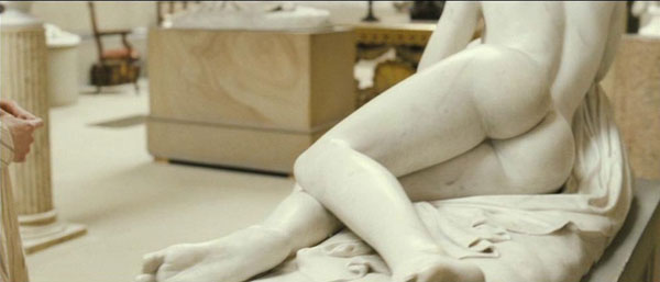
As in the Hunsford scene, we
enter the gallery behind Keira Knightley,
which gives viewers a visual clue to see the scene from her point of
view, as though she were our avatar. Once in the gallery, the
camera pans and circles around various sculptures, pulling in for a
closer and very penetrating view, treating the voyeur in all of us to
what we might choose to zoom in on if we were controlling the visual
apparatus. Hence, by manipulating the depth of the shots of which
the scene is composed as the camera leads us through the gallery,
Wright has given us “more immediacy” and the illusion that we are free
to navigate the scene, choosing where to go next, circling a full 360
degrees, as if by our own volition.

Importantly, only Knightley’s
hand and part of her skirt are visible at
two points in this series of continuous shots that follow her entry
while the rest of her body has been excluded from the frame. This
way of positioning the seeing subject in the frame is known as a
subjective point-of-view shot, and it is the standard and constant
perspective of all first-person shooter games. Significantly,
however, until the first-person shooter taught us to read this kind of
shot as the embodiment of ourselves on a virtual landscape, the
subjective point of view was used exclusively to “show the optical
perspective of a drugged, drowsy, drunk, or otherwise intoxicated
character,” to provide “a sense of detachment,” or to convey “the
vision of aliens, criminals, monsters, or characters deemed other wise
inhuman by the film’s narrative” (Galloway 46, 48, 50).
First-person shooters have, however, made this aesthetic code so
familiar that subjective shots are now used to signal all of the above
as well as active
embodiment, to heighten the effects of cinematic
suture, and to lend the spectator the sensation of a lean-forward
medium such as the video game. This sense of hands-on tactility,
or what game scholars refer to as the haptic effect of games, is
visually suggested in the following scene, where more than 20 seconds
of screen time are devoted to a close-up of Knightley’s hand as she
fondles two small statues and what might presumably be a letter that
Darcy is writing. By having Knightley drag her hand over the
statuary, the director invites us to enter into the sensuality and
eroticism of the scene in a way that contemporary audiences, accustomed
to hands-on experience, can understand and identify with.
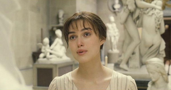
While the style of the gallery
scene triggers spectators’ sense of
tactility, it also obsessively foregrounds Keira Knightley as the
looker, the owner of the gaze. In shot after shot, we see her
staring at various eroticized statues until she comes to Darcy’s bust,
at which she lasciviously stares with lips parted for more than 45
seconds of screen time.
The gaze here has been decidedly transferred to Elizabeth and, given
that the statue faces
away
from the viewer, there is no question
whatsoever that any of the discomfort that Austen wrote into this scene
in the novel might be glimpsed through Knightley’s looking. And
just in case the implications might be lost on the viewer, the bridge
to the next scene is through Knightley’s gaze, which penetrates the
private space of a room where Darcy’s sister plays the piano.
Until she is caught in the act of this highly intrusive gesture, we are
again presented with several sustained shots of Knightley’s covert,
voyeuristic and controlling gaze that organizes the scene.
Conclusion
Jane Austen’s
Pride and Prejudice
has been mobilized in the service of
political, ideological and economic agendas at various junctures over
the history of its screening. The novel has been adapted as a
critique of the upper classes and a validation of labor; as a means of
stimulating the British tourist industry; and as a vehicle for the
promotion of national heritage. More specifically, the Pemberley
scene is the nexus of sexual and visual politics. Classical
Hollywood cinema chose to eliminate the scene to avoid the risk of
presenting a heroine whom audiences in 1940 might have found
unpalatably empowered. The revisionist 1995 A&E/BBC
mini-series on the other hand, doubles the objectification of Darcy by
showing two portraits amenable to Elizabeth’s gaze, artfully treating
feminist viewers to pleasurable moments where the conventional power
structure of the gaze is inverted.
The 2005 Focus Features film of
course was made to appeal to its
contemporary audience, but
how
the film does this is somewhat more
complex. First, that statues are somehow “better than pictures,”
in Moggach’s words, is related to the current state of digital culture
whereby we have become accustomed to hands-on, three-dimensional,
interactive environments and narratives that pleasure more senses than
sight and hearing alone. Hence, rather than passively viewing the
illusion of a three-dimensional object of desire projected onto a flat
canvas, it now seems somehow appropriate that Knightley’s Elizabeth
circles the statues while actively looking and touching. By
heightening the level and kinds of tactility represented in the
segment, this particular filming of the novel’s gallery scene
communicates the emotion of the moment in a way that contemporary
viewers can easily grasp and identify with. This scene shares
those features of computer games that could viably be reproduced in
film and provides spectators with the illusion of freedom of movement
along with the illusory option to actively choose points of focus.
Moreover, part of the audience to
which the film seeks to appeal is
also the audience segment most likely to identify with Keira
Knightley. This group is composed of young, new-wave feminists,
who might not see themselves as feminists at all, and who do not
remember having to feel satisfied with being granted the power of the
gaze for a fraction of the total screen time. Indeed, this viewer
segment might well feel it owns the gaze, however temporary or
superficial that ownership turns out to be and, in fact, Keira
Knightley possesses it through most of the film. In other words,
many aspects of Wright’s adaptation are far from innocent, catering to
an audience comprised of many new-wave feminists, who know, however
implicitly, about the gaze and are familiar with interactive media.
Henry James once criticized
“publishers, editors,
illustrators, producers of the pleasant twaddle of magazines” for
having bent Austen to “their material purpose, so amenable to pretty
reproduction in every variety,” and provoking “mechanical and overdone
reactions” on the part of readers and spectators (qtd in Lock
84). Since James wrote those lines, Austen has continued to serve
producers and directors who hope to provoke emotional responses from
audiences, whatever their “material purpose” may be. It seems
unlikely then, that adaptations of
Pride
and Prejudice will cease to be
made, whether as spoofs or as “serious” costume melodramas that
advertise national heritage, or as bids to mobilize whatever ideology
is contemporary with their moment of production. This said,
however, I also think it is safe to assume that audiences will go on
taking great pleasure in the spectacle of Austen’s narrative transposed
into any number of visual media, feeling they have somehow been brought
closer to that greatest of English romance writers to whom James
referred as “everybody’s dear.”
Jenkins, Henry. “‘Complete Freedom of Movement’: Video Games as
Gendered Play Spaces.” From
Barbie to Mortal Kombat: Gender and
Computer Games. Ed. Justine Cassell and Henry
Jenkins.
Cambridge: MIT P, 2000. 262-98.
_____. “Game Design as Narrative Architecture.” First
Person: New Media as Story, Performance, Game. Ed. N.
Wardrip-Fruin and P. Harrington. Cambridge: MIT P, 2004.
118-30.
Pearce, Celia. “Sims, BattleBots, Cellular Automata God and Go: A
Conversation with Will Wright.” Game
Studies 2.1 (2002). 4
May 2007 http://www.gamestudies.org/0102/pearce/


